



Simpler mobile experience for cross-border currency exchange
A fintech mobile experience designed to simplify currency exchange, transfers, and wallet management through a clear, trustworthy interface built around ease of use.

Making international money movement feel simple
Currency exchange can quickly become complicated. Different currencies, rates, transfers, wallets, and financial information can make even a simple transaction feel like work.
RemitEasy was created around a simple idea: make currency exchange and international money movement easier to understand and easier to use.
The concept was to give users a mobile experience where they could manage their money, exchange currencies, and make transfers without having to fight their way through a complicated interface.
My role was to shape that experience from the product structure and user flows through to the visual design, brand direction, and interactive mobile prototype
Outcomes
Outcomes
The project resulted in a complete mobile product concept covering the major journeys required for the RemitEasy experience.
What was delivered
Complete mobile UI
A cohesive interface covering the core product experience.
User flows
The major journeys were mapped before moving into detailed UI.
Brand direction
A visual identity designed to support the fintech product.
Interactive prototype
The screens were connected into a navigable product experience.
3-week delivery
The product concept and design work were completed within three weeks.


Understanding the Experience
Before jumping into screens, I needed to understand how everything connected.
I mapped the major journeys of the application, from onboarding and authentication to the core areas of the product.
The user flow helped me see the product as a system rather than a collection of screens.
I mapped areas including:
Onboarding
Login and registration
Home
Wallet
Transfers
Currency conversion
Transactions
Profile
Cards
Notifications
Support
This gave me a clear picture of how users would move through the product before I started designing the interface.
Image recommendation

Building Trust From the First Screen
For a financial product, trust starts before the first transaction.
I wanted the first few moments of the experience to communicate simplicity and confidence rather than financial complexity.
That led to a clean onboarding experience with focused messaging and clear actions.
Instead of overwhelming users with information, each screen had one primary purpose.
The result was an onboarding journey that introduced the product gradually while keeping the next step obvious.

Simplifying the Core Product
The heart of RemitEasy was the experience after onboarding.
This is where users needed to manage their money, view balances, convert currencies, and initiate transfers.
I focused on creating a strong information hierarchy so the most important information was immediately visible.
The home experience brings key financial information forward while keeping actions such as transferring and converting money easy to find.
For me, the goal was simple:
Don't make users think harder than the task requires.
Financial products already contain enough complexity underneath. The interface shouldn't add more.

Creating a Visual Language
Once the experience structure was established, I worked on the visual direction.
The identity needed to feel modern enough for a fintech product while still communicating reliability.
I developed the visual language around the RemitEasy identity, carrying the brand through the app experience and supporting assets.
Typography, color, icons, spacing, and interface components were brought together to create a consistent product experience.
The objective wasn't to make every screen visually loud.
It was to make the entire product feel like it belonged to the same system.

From Screens to a Real Experience
A static screen can look good.
A product needs to work.
I connected the key screens into an interactive prototype so the experience could be explored as a real product rather than a collection of individual designs.
This allowed me to review transitions, navigation, interactions, and the overall flow of the experience.
It also made it easier to communicate the product vision and demonstrate how the different parts of RemitEasy connected.
Reflection
Three weeks, one complex product, a lot learned
RemitEasy was one of those projects where the interface looked simple on the surface, but the thinking underneath had to be much more deliberate.
Working on a fintech product taught me to pay closer attention to how information is presented when the user's money and confidence are involved.
It also reinforced something I still believe today:
Good product design isn't about removing complexity from the product. It's about making that complexity feel simple to the person using it.
In three weeks, I took the concept from structure and user flows to a complete visual experience and interactive prototype.
Looking back, RemitEasy became an important project in my growth as a product designer. It pushed me to think beyond individual screens and consider how brand, interaction, information, and trust come together to create a product people can understand.
The goal was to make it feel easy
Other Projects
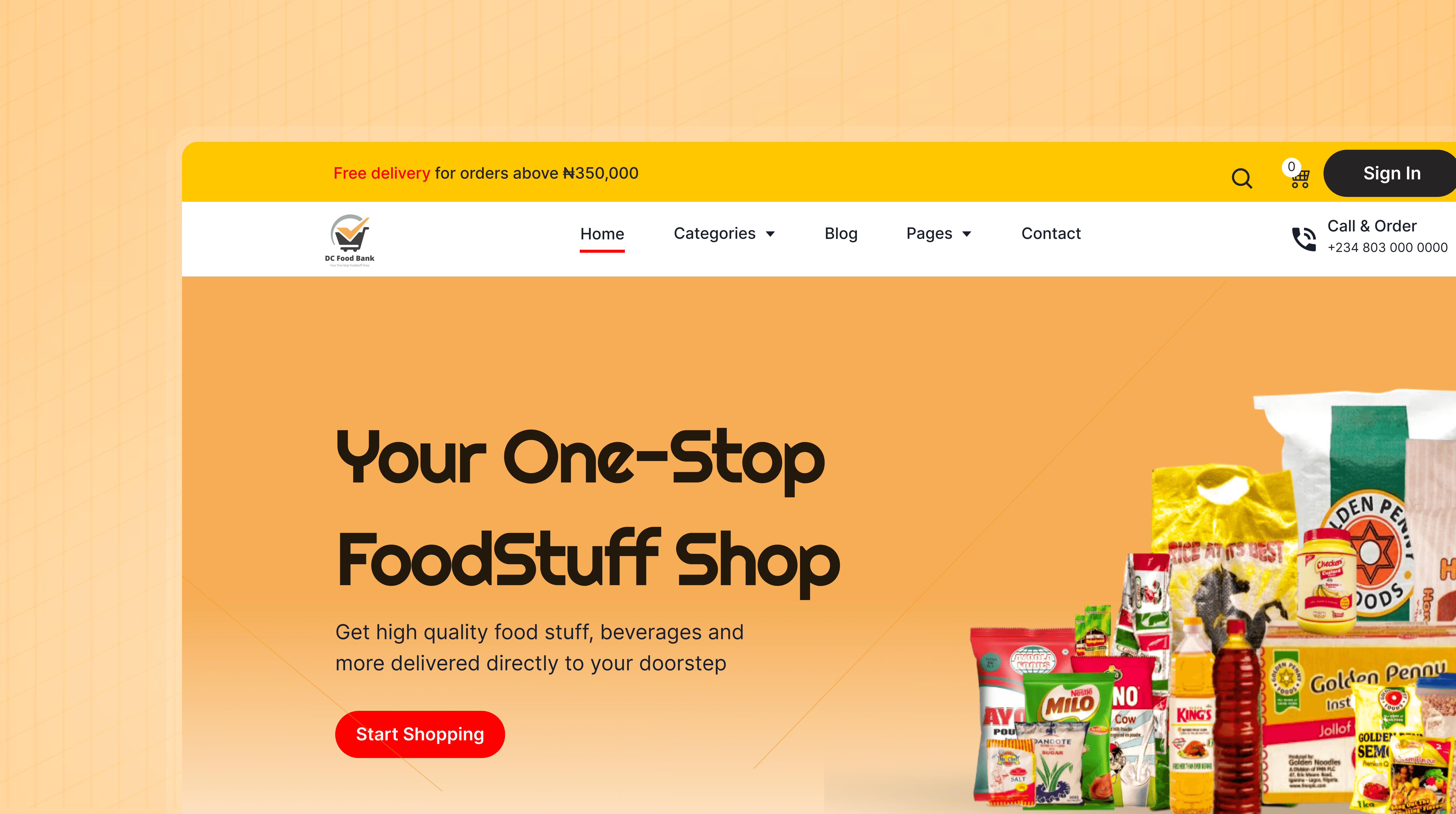
Turning DC Food Bank Into an Online Grocery Experience
Collaborated with a product team to design a full eCommerce platform that lets users order groceries, delivered straight to their doorsteps.
Introduced a smart image-to-cart feature and built a user-friendly website.
Ecommerce
Lagos
Product Design

The Everest Crest Experience
Designed a modern school website and management dashboard for Everest Crest High School
Complete digital ecosystem for academic management and community connection
Education
Lagos
Product Design
%