


Redesigning SEORCE Dashboard for Clarity & Conversion
Transformed a complex SEO analytics platform into a seamless, intuitive experience

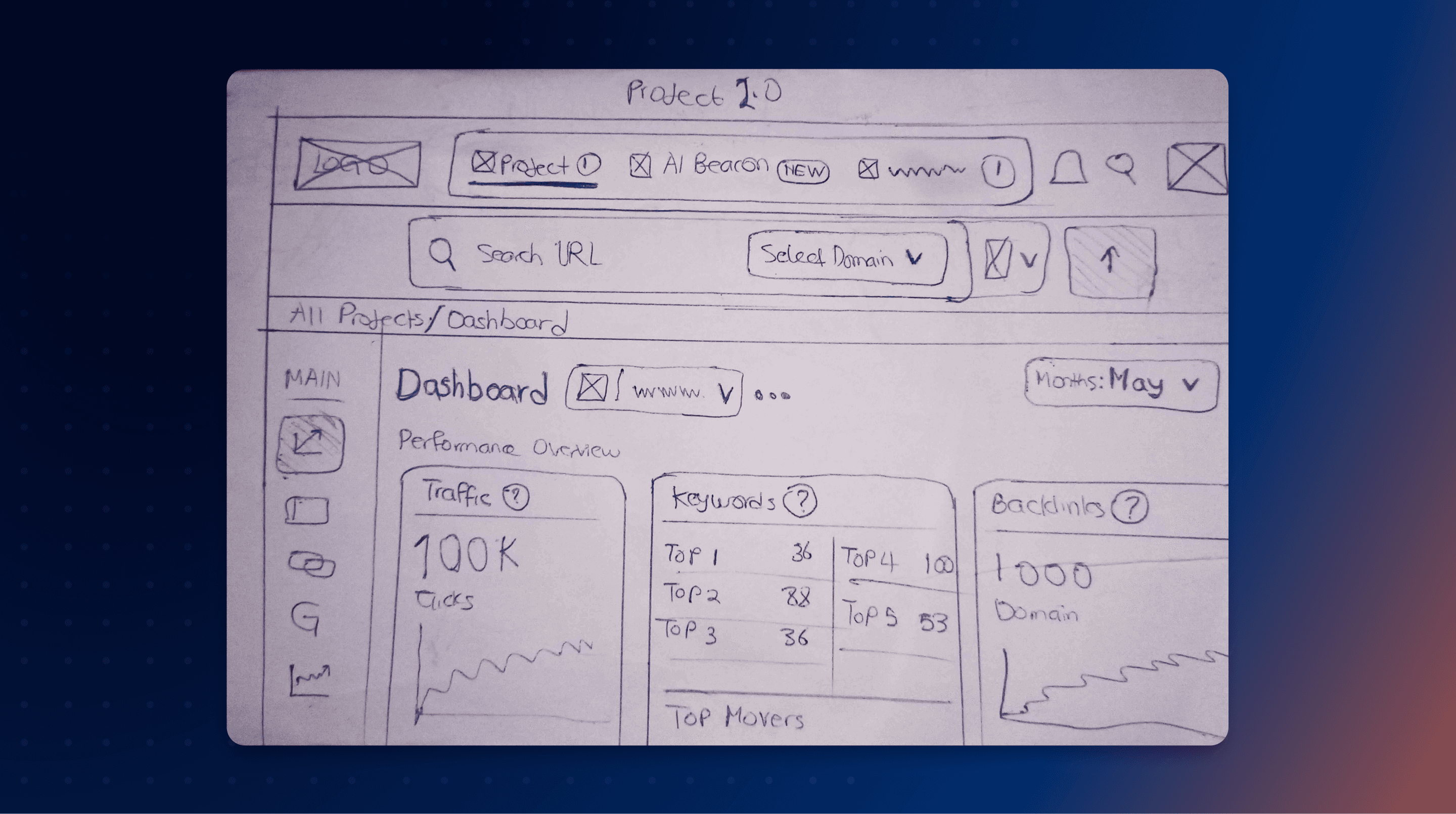
When SEORCE reached out, they already had a dashboard design, but it was incomplete, confusing, and far from the powerful vision they had in mind. Their goal was simple yet ambitious:
When I joined, I was stepping into a half-built product with scattered components and unclear direction. But I saw potential.
I immersed myself in their ecosystem, studied competitors, listened to their team in India, and asked every question I could. Bit by bit, I translated technical SEO jargon into design clarity. The aim was to turn complexity into confidence.
Outcomes
The redesigned SEORCE dashboard delivered more than just visuals it changed how users experienced SEO.
m2x increase in dashboard engagement metrics
Contributed to SEORCE’s successful funding milestone
Strengthened collaboration between design and engineering teams


The Process
1. Understanding the Problem
When I first got involved, SEORCE had an old design that wasn’t aligned with their new direction. It lacked usability and visual structure. I started by conducting an in-depth audit, mapping pain points, evaluating flows, and clarifying the team’s definition of success.
Working across time zones with their Indian product team was new for me, but I quickly adapted, starting to ask targeted questions and organizing daily syncs and aligning design goals with business needs.
2. Research and Strategic Foundation
Before moving pixels, I had to understand SEO deeply. I took a short SEO course to grasp the metrics, tools, and terminology their users live by. I benchmarked competitors like Ahrefs and SEMrush to see what users expected and where SEORCE could stand out.
The insight was clear: most SEO platforms overwhelm users. We had to build something intelligent yet human a dashboard that breathes simplicity.
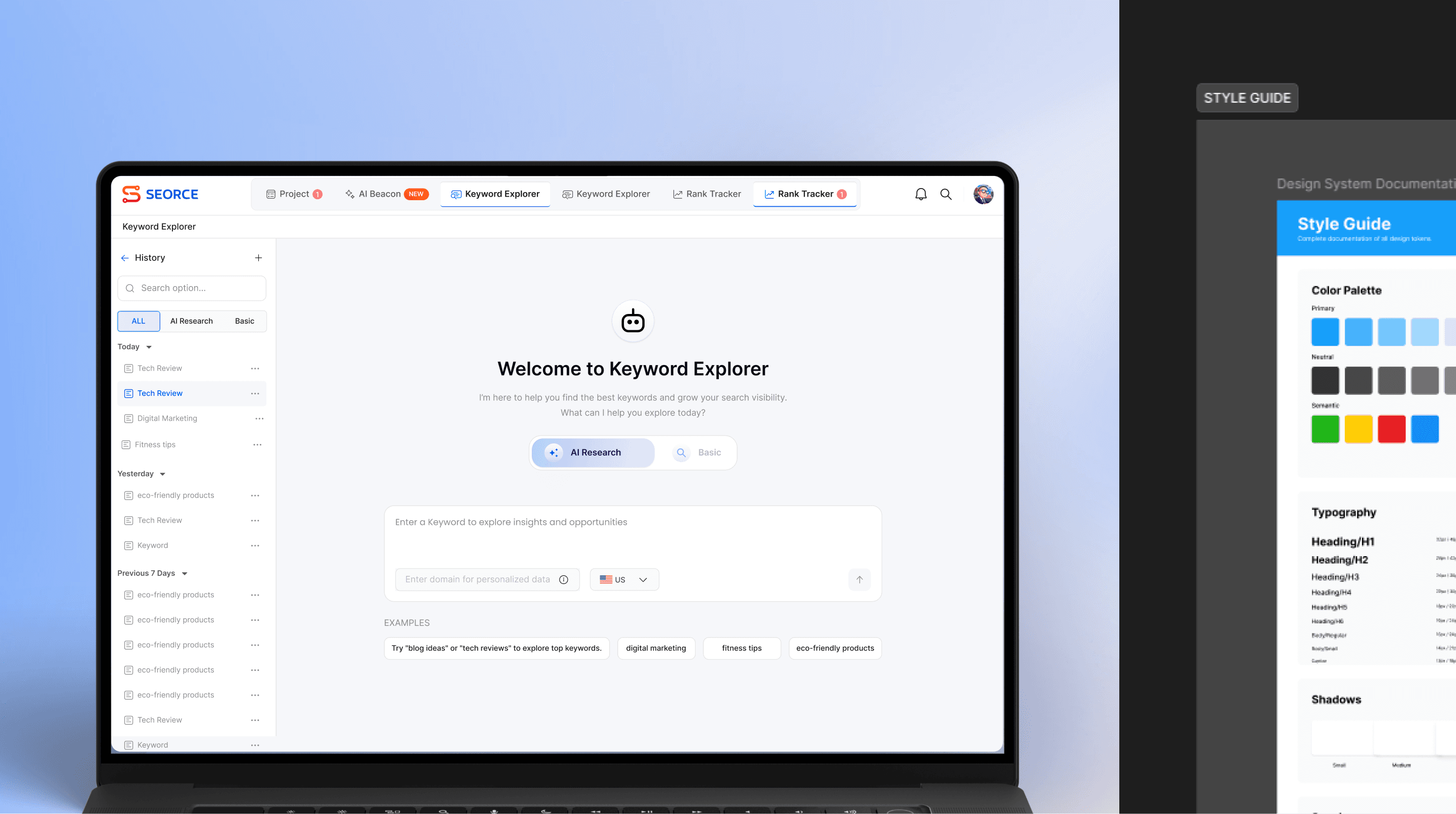
3. Designing for Clarity
With research in hand, I created a flexible design system and began structuring layouts around user priorities — not just data. I focused on hierarchy, whitespace, and visual rhythm to make complex metrics readable at a glance.
This stage was where design and empathy met. Every color, chart, and component was tested against one question: “Would this make SEO feel easier?”
4. Collaboration and Iteration
As we approached the MVP launch, SEORCE brought in a second designer to speed up production. It turned into a collaborative sprint exchanging feedback, refining flows, and pushing each other toward excellence. In just two months, we released a completely refreshed interface sharper, faster, and more intuitive.
It wasn’t just a redesign it was a team evolution.
Reflection
This project tested every skill I had and strengthened the ones I didn’t.
It taught me how to design under pressure, collaborate across cultures, and translate complexity into clarity.
Working on SEORCE reminded me that great design isn’t about pixels it’s about understanding people, their goals, and their confusion.
Today, SEORCE’s product continues to evolve, and seeing them move toward funding and growth feels like a shared victory.
Other Projects
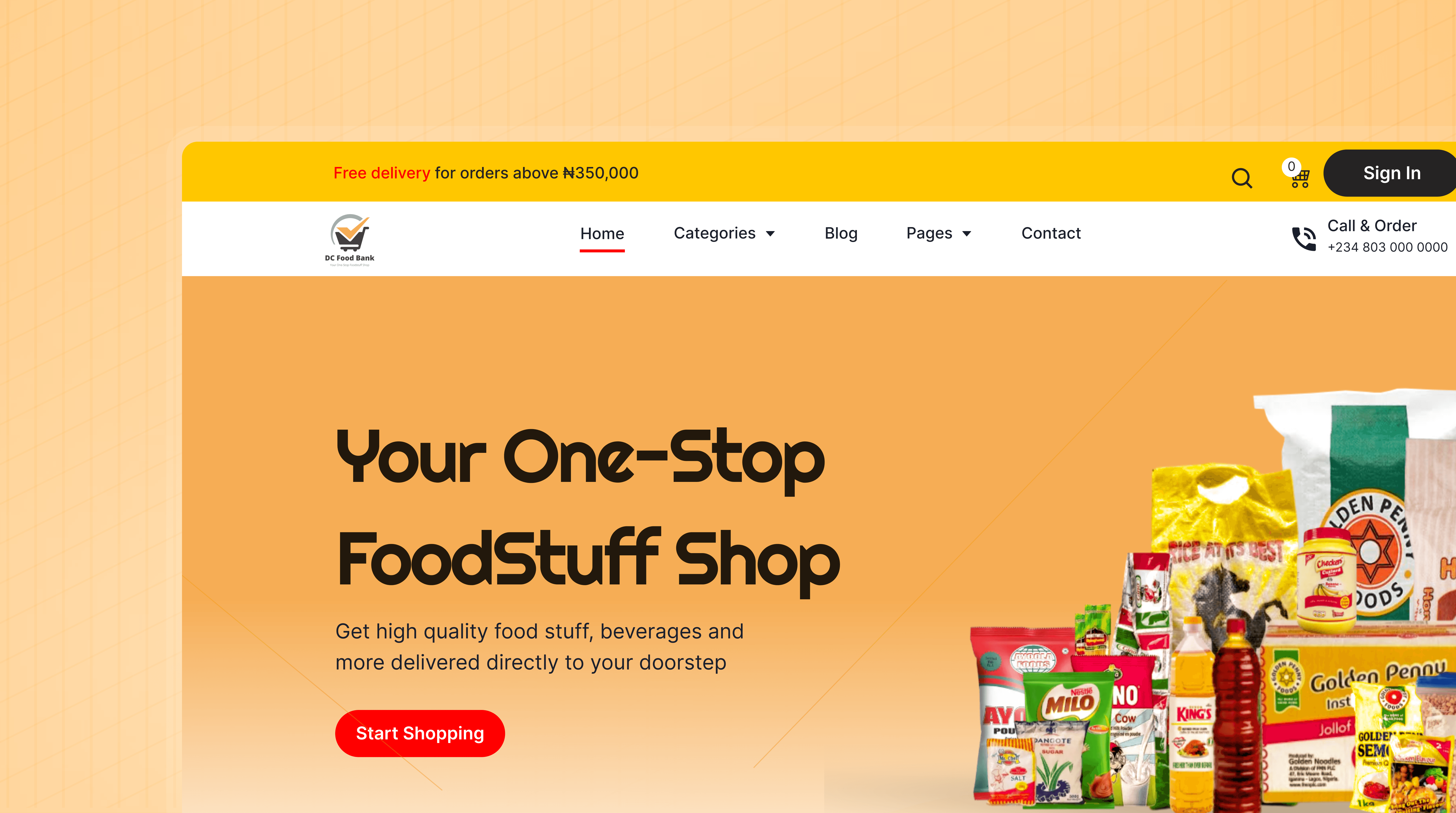

Turning DC Food Bank Into an Online Grocery Experience
Collaborated with a product team to design a full eCommerce platform that lets users order groceries, delivered straight to their doorsteps.
Introduced a smart image-to-cart feature and built a user-friendly website.
Ecommerce
Lagos
Product Design
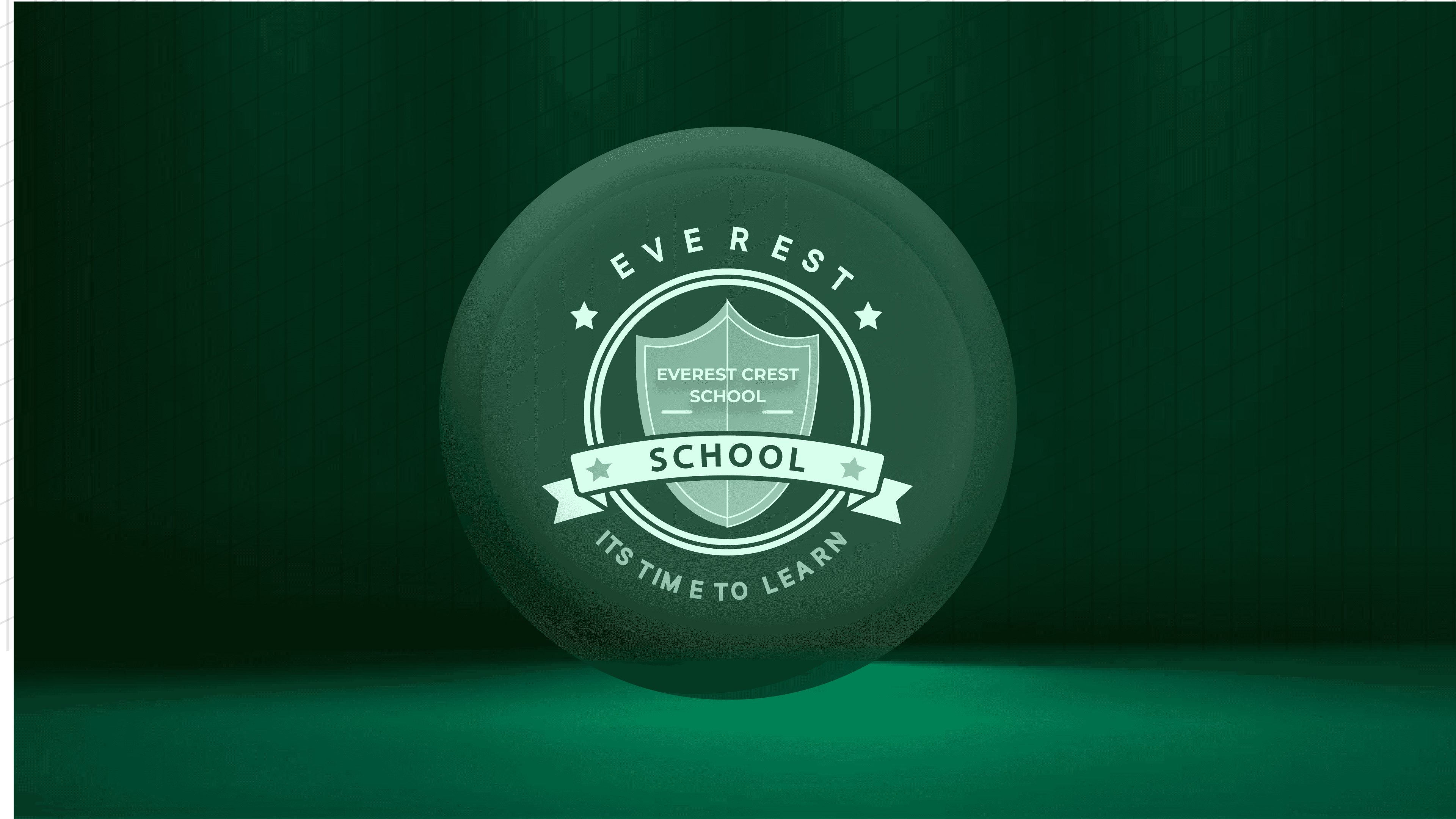

The Everest Crest Experience
Designed a modern school website and management dashboard for Everest Crest High School
Complete digital ecosystem for academic management and community connection
Education
Lagos
Product Design
