


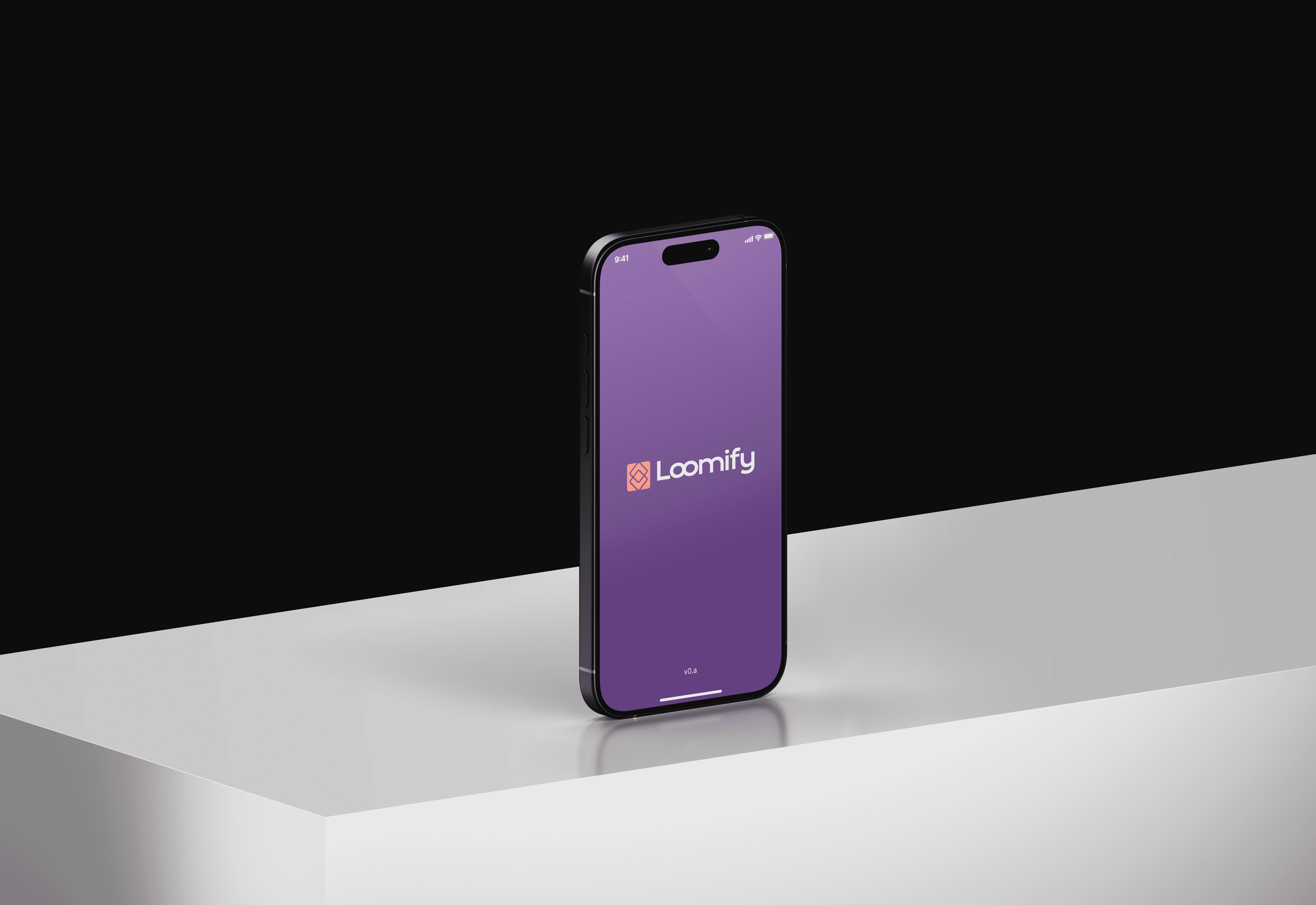
Designing Loomify’s Mobile Marketplace Experience
Built a scalable mobile marketplace platform empowering new sellers to auction and sell products easily

Loomify set out to build something ambitious a mobile marketplace where emerging sellers could auction and sell products with ease. Their vision was to make digital commerce simple, human, and fast.
When I first heard about the project, I didn’t wait for an opening I reached out directly to the CEO. They were screening designers through a task-based challenge. I completed mine in just two days, gave it my all, and sent it over.
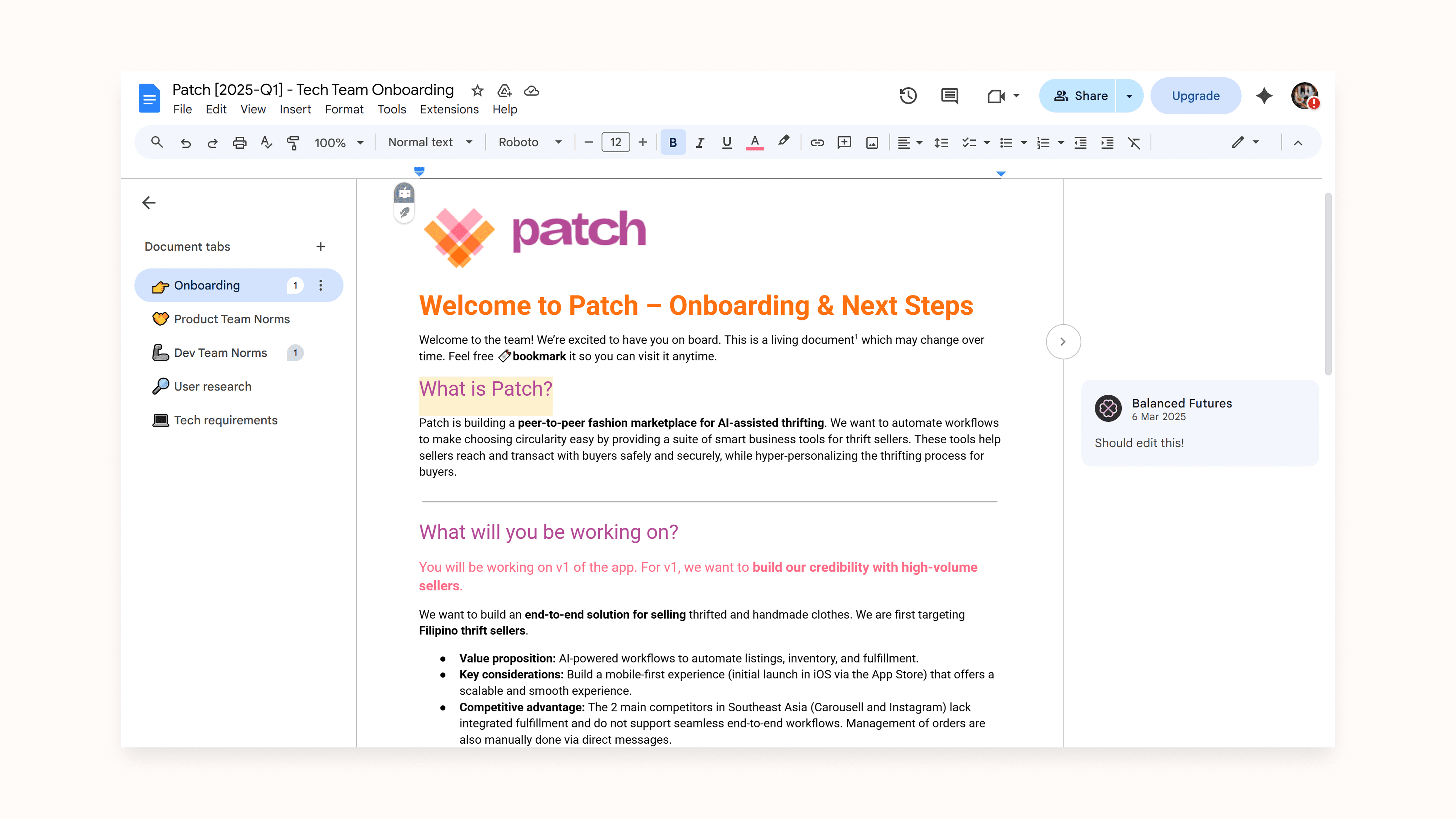
Months passed without a response until I got an email from a company called Balanced Futures (previously Patch). It turned out to be Loomify rebranded. They remembered my work, and this time, I was onboarded alongside another designer to help bring the app to life.
That’s where the real story began.
Outcomes
Our collaboration produced a full-fledged mobile MVP designed, refined, and delivered within an aggressive timeline without compromising craft or clarity.
Key Outcomes:
Complete mobile marketplace MVP delivered in 6 weeks
Established repeatable UX process for future iterations
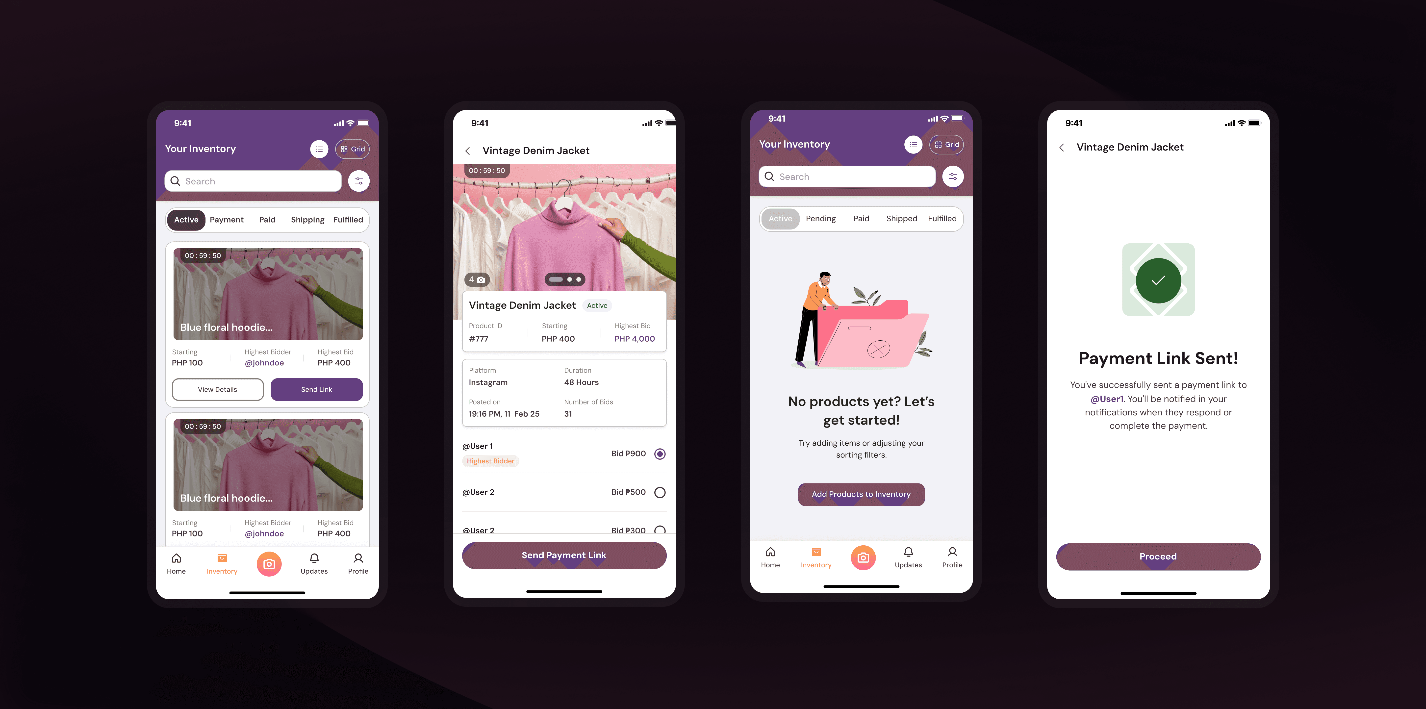
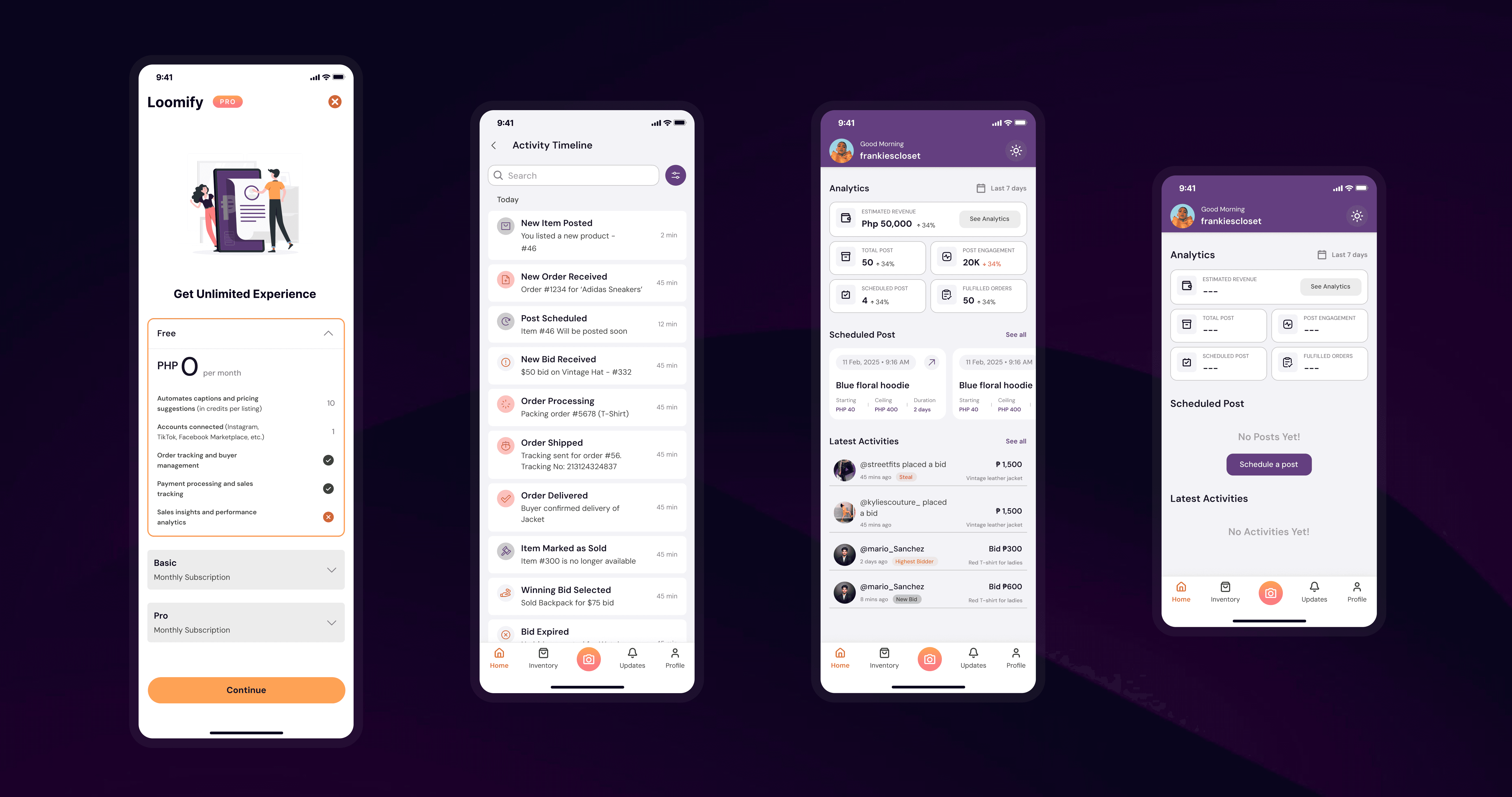
Improved seller onboarding and product listing flows
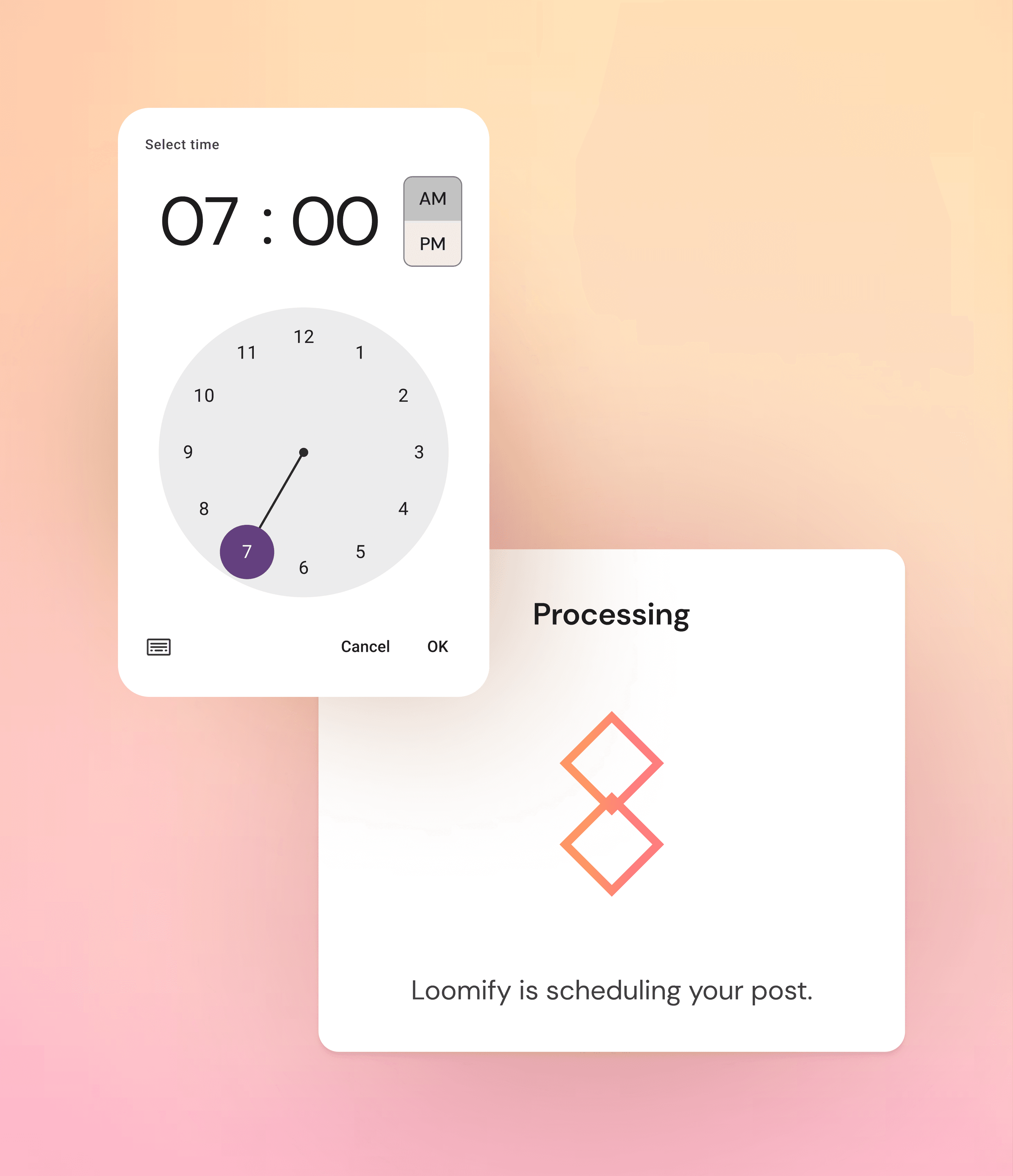
Designed custom animations and microinteractions for engagement
Strengthened collaboration and delivery under tight deadlines

The Process
1. Kicking Off with Intention
When we started, there was immediate pressure to move fast. My co-designer wanted to jump straight into wireframing which is a common impulse but I knew skipping discovery would cost us later.
So I suggested we pause, research competitors, and understand the space first.
That decision changed everything. It grounded the project in context and helped us make smarter, more defensible design choices later on.
2. Building the Foundation
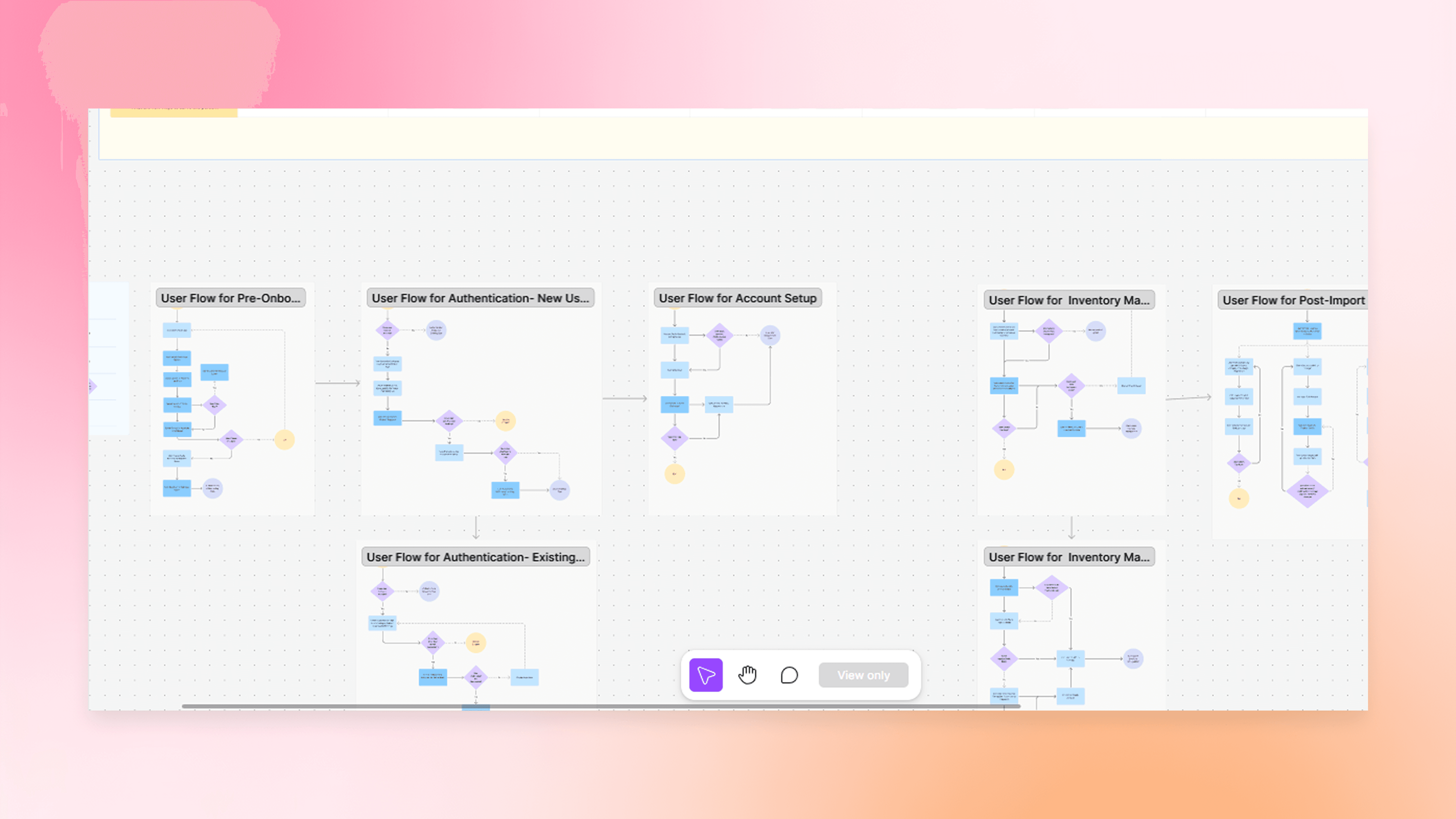
We identified our users small-scale sellers and side hustlers looking for simpler ways to auction and manage their sales.
Then we mapped out their journey: listing products, managing bids, tracking payments.
From there, we created wireframes, prioritized core flows, and iterated quickly to test structure and flow logic before touching visuals.
3. Designing with Purpose
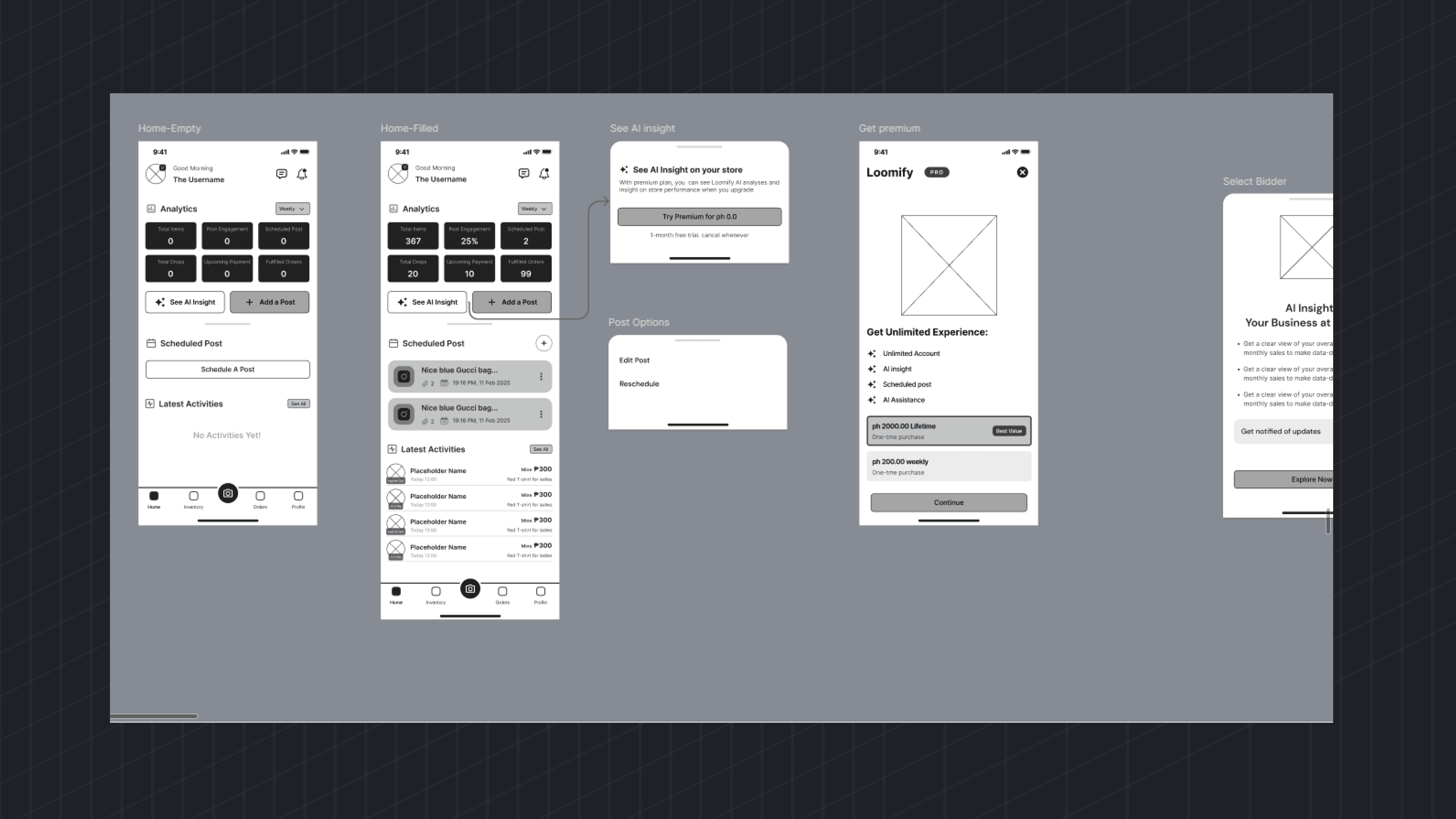
Once the structure was validated, we dove into high-fidelity design bringing the app to life with custom animations, illustrations, and interactive moments that made every touchpoint feel fluid and intentional.
We built a minimal design system for consistency and seamless handoff to developers, ensuring every detail spacing, type, color, and interaction was documented.
4. Delivery and Collaboration
The timeline was tight six weeks from start to final design handoff. But because we had a process, we didn’t just meet the deadline we hit it with confidence.
We maintained open feedback loops with stakeholders, adapted to technical constraints, and shipped a polished MVP on time.
The experience also taught me the value of mentorship guiding another designer while balancing creative leadership and project management.
Reflection
Loomify reminded me that speed doesn’t have to mean chaos.
The project proved that when you combine structure with urgency, you can move fast and still create something meaningful.
It taught me how to lead by conviction not by command and that the best results come when you slow down just enough to understand before you build.
What began as a cold outreach turned into one of my most rewarding projects a masterclass in collaboration, clarity, and consistency under pressure.
Other Projects
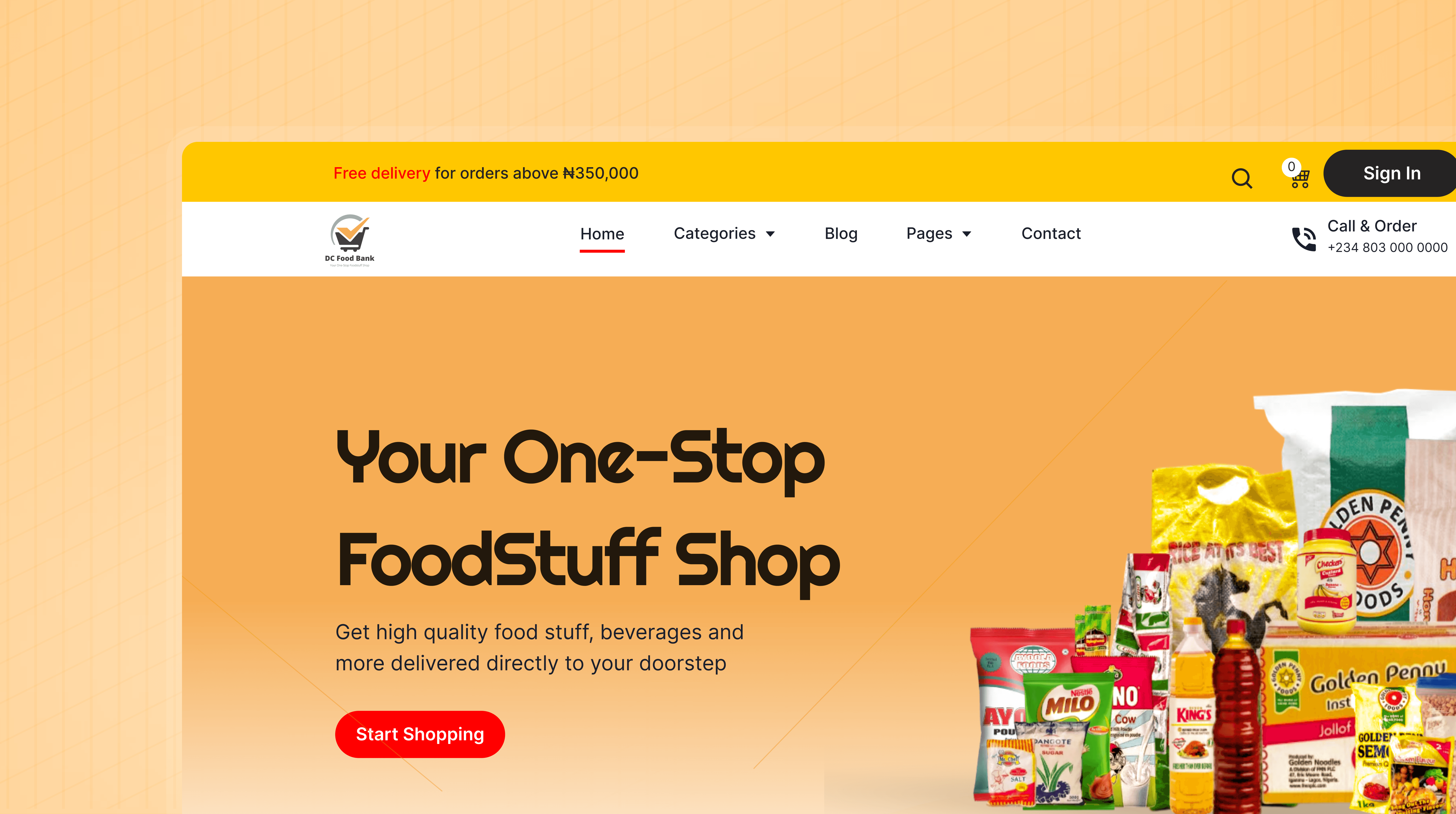

Turning DC Food Bank Into an Online Grocery Experience
Collaborated with a product team to design a full eCommerce platform that lets users order groceries, delivered straight to their doorsteps.
Introduced a smart image-to-cart feature and built a user-friendly website.
Ecommerce
Lagos
Product Design

The Everest Crest Experience
Designed a modern school website and management dashboard for Everest Crest High School
Complete digital ecosystem for academic management and community connection
Education
Lagos
Product Design
